Cupcake
Design Systems | Documentation | Visual Identity | Product Strategy
March 2022 – Present
Last updated Dec 2022
Company
Previously known as the popular check-in app, Foursquare in 2022 is the leading cloud-based location technology platform used by companies like Uber, Airbnb, JetBlue, and Spotify. They have multiple products for data analysts, developers, and marketers to harness the power of their technology and data in other platforms.
Project Overview
With lean product teams across 4 different products, Foursquare needed a robust design system to help designers and engineers stay nimble.
Prior to this project, Foursquare had a design system that was worked on in a start-and-stop fashion for 2-3 years. But due to lack of resources, processes, and momentum, the design system remained incomplete. It was never maintained or developed, so it never saw the light of day into any of Foursquare’s products. Eventually, it became too outdated for even designers to use.
Over the course of 9 months, I designed an MVP for Cupcake, the new design system. My goal was to increase efficiency and improve workflow for both designers and developers, and create consistency across the UI and UX of all 5 products. The open-sourced system can be found here.

Impact
10
40
detaches out of 815 inserts in the last 30 days
components designed
21%
42%
engineering efficiency improvement**
designer efficiency improvement*
*Designers took about 25 min to create a mock that would've taken an hour
**Engineers saved 3 days per 14-day sprint on styling
I led the design for Cupcake, while the development team was composed of representatives from each product team who volunteered their spare time to help build components.
For a while, I also acted as the product manager for Cupcake. I tracked adoption and development progress, managed our Jira board, reached out to product teams to gauge commitment, and determined roadmaps and prioritizations. In Q3 of 2022, I presented Cupcake to our executive engineering team to push for dedicated resources. As a result, we received a project manager owner who provided support for these responsibilities.
Team
Process
Our process can be simplified into 4 steps – audit, design, document & build, and release.
Audit
My first task was to audit the 4 products to identify the number and types of components needed for an MVP, as well as common patterns that I could find to guide the design of the new components later on. I looked at dozens of product designs and screenshots, excavating similar components from each and bucketing them into groups for analysis.
A screenshot of the component audit that we conducted across four products
Design
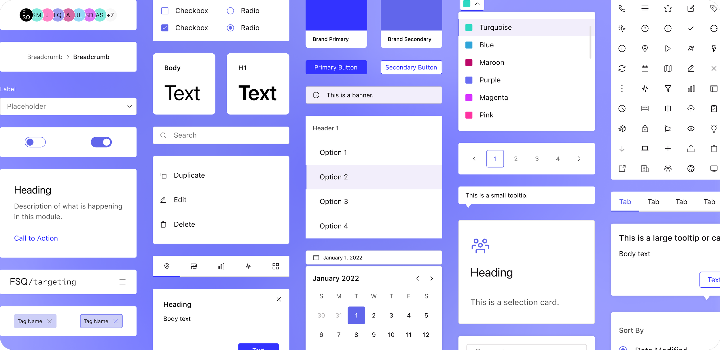
Then I began designing in 2 week sprints, keeping in mind that we didn’t want to change the look and feel of any of Foursquare’s products. The UI was already pretty established; I just needed to add consistency and reusability.
I identified the most common patterns (e.g. sizes, colors, typography) across the products for each component, and then standardized them across the library. For example, a majority of components had two sizes: a small (32px height) and a large (40px height). Colors were all assigned a meaning – light purple, for instance, was used as a hover state color across every component in the library.
Designing components didn’t just stop at the UI, though. I did research into best UX practices, looked at competitors’ examples of components, and tested components to ensure the best usability and experiences. Additionally, I built in accessibility and responsiveness into every component by considering breakpoints, contrast standards, screen readers, and more.
Document & Build
After designing the components, we would document them for other designers to understand how to use them, and developers to understand how to build and implement them.
The contents of the documentation varied by component. It included things like:
Specs and redlines for the UI
Usage guidelines
Interaction annotations
Do’s and don’ts
We met biweekly with developers to answer any questions that they had around the components’ design, and weekly with designers to walk them through how to use components. We also created a Confluence space and made how-to videos for designers to reference asynchronously.
Before anything was published into the library, I conducted design QA to ensure that components looked and behaved as anticipated.
A sample of the documentation that we wrote for the Vertical Menu component
Release
We launched the design system iteratively, only releasing 3-4 components at a time. Our goal was to be able to learn from the previous batch of components in order to improve processes, documentation, and usability for the next batch.
We implemented feedback processes via biweekly meetings, office hours, and Slack channels to address bugs, design enhancement requests, and any other miscellaneous questions.
Finally, we created a design systems website for the company, so that anyone who wanted to learn more about the design system or how to use its components would have a single source of truth.
Old design
New design (with Cupcake)
This is an example of how components were implemented into one of the pages on Foursquare’s Developer Console product. Prior to Cupcake, this page had accessibility issues (e.g. input fields didn’t pass WCAG standards), UX issues (e.g. incorrect use of banner), and could not be viewed on tablet or mobile devices.
When this page was redesigned with Cupcake components, we addressed the accessibility and UX issues within the component themselves. We also made all of our components responsive (using Tailwind CSS breakpoints), making it easy developers to do the same for the whole page.
Cupcake’s MVP components are still being built, due to the lack of dedicated resources on the development side. We plan to complete these components by June 2023.
From a design standpoint, moving forward we’ll focus on maintaining the library. This includes addressing change requests, completing more testing to improve the usability of our components, and tracking adoption.
Next Steps
