February 2020
Ticketmaster Queue Configuration Tool
Redesigning an internal tool
Deliverables
Visual design
Background
The Smart Queue is Ticketmaster's "virtual line" for purchasing tickets for high demand events. I was tasked with redesigning an internal tool used by stakeholders to manage settings for artists' queues.
The Challenge
Using Ticketmaster’s design system, I needed to redesign the tool in a way that was scalable for managing multiple events at once and for adding manageable features later on. Additionally, I was required to work with the Smart Queue product managers to identify user pains and execute solutions that tailored more towards the tasks they used the tool to complete.
The Original Tool
Event managers used the QCT to complete tasks like turning an event’s Smart Queue on/off, sending messages to all of the fans waiting in the Smart Queue, and adding specific requirements to each Smart Queue.
Unfortunately, the original tool didn’t take into account the user’s goals, making it more difficult and time-consuming to utilize.
Finding Inspiration
I read up on some case studies on table design to identify features that I should add in for usability, readability, and intuitiveness.
A couple of things I found really useful and considered adding into my design were:
Zebra Stripes
Alternating row colors helps users read information while they scan quickly down the page without losing their spot.
Truncation
When there’s a lot of columns, users should be able to reduce and expand the sizes of each. I found that it would be easier for developers if I just combined some of the columns. However, truncation through the grouping of rows was something to explore.
Displaying Common Actions
In the original tool, users needed to select each row individually and go up to the top right hand corner of the header to complete any actions. But it felt more intuitive to keep important actions within the rows so that they didn’t have to skip around the page as much.
Adding New Features
Based on this research and feedback received from a couple of users on earlier iterations of the tool, I was able to come up with some key features that would make the tool more usable while keeping work for the developers at a minimum.
Scalability and Readability
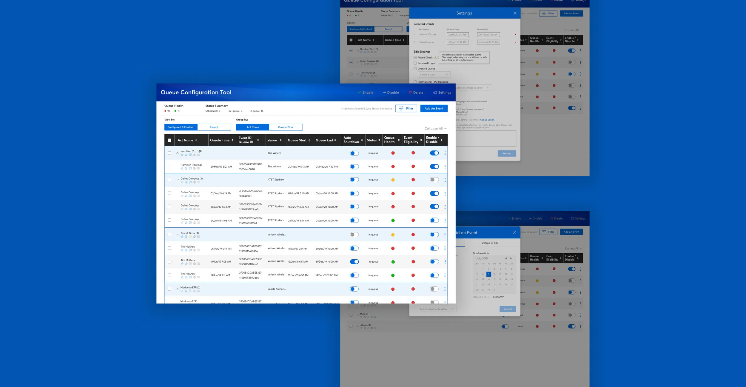
Using icons to show settings for each events allows possibility for more settings to be added and eases ability to read through information.
Viewing Capabilities
Users can view and group by more relevant categories than allowed in the original design. They can also expand/collapse listings based on these groupings to more easily organize and search.
Filtering
A one-stop shop for all filtering categories minimizes the number of clicks needed to filter and makes them easier to find and keep track of.
Enabling Bulk Settings
Users can now bulk edit all settings of multiple events, making this action much more time effective and efficient. Events with conflicting settings are presented with a warning and can be overwritten.
Simplifying Adding Events
To streamline the uploading process, events can now be added in one place (regardless of upload method) with settings editable from the beginning.
The Final Redesign
Data Visualization Tables
Conclusion
The new design for this tool was implemented by two developers and the Smart Queue PMs. I worked with this team until March 2020 to help ideate and design solutions to new arising user issues by meeting on a biweekly basis.
While designing a table didn’t seem like the most glamorous project at first glance, the level of complexity and the importance of this tool for smoother internal operations taught me to design with purpose and clarity. Every decision made and feature added in this tool needed to be explained in order to justify the work to developers and the benefits to stakeholders. Additionally, the project required me to gain a deep understanding of the business environment we worked in at Ticketmaster.

